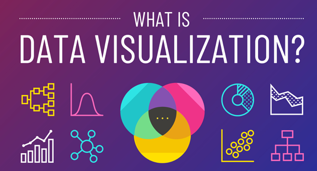
Data visualization is the graphical representation of information and data. It involves using visual elements like charts, graphs, and maps to make complex data more accessible, understandable, and usable. This process helps to identify patterns, trends, and insights that might not be immediately evident from raw data. Common tools and techniques used in data visualization include:
- Charts and Graphs: Bar charts, line charts, pie charts, histograms, scatter plots, etc.
- Maps: Geographic maps, heat maps, and chloropleth maps for spatial data.
- Infographics: Combining text, images, and data visualizations to tell a story.
- Dashboards: Interactive platforms that allow users to monitor and analyze data in real-time.
- Network Diagrams: Visual representations of relationships between entities.
Effective data visualization requires understanding the data, choosing the right type of visualization for the information, and designing it in a way that communicates the message clearly and efficiently.
What is Data visualization in Power BI?

Data visualization in Power BI refers to the process of using Microsoft’s Power BI tool to create interactive and shareable dashboards, reports, and visual representations of data. Power BI provides a comprehensive suite of features that enable users to connect to various data sources, transform data, and create visually appealing and insightful visualizations. Power BI’s powerful data visualization capabilities help organizations transform raw data into meaningful insights, facilitating better decision-making and strategic planning. Key components of data visualization in Power BI include:
- Visualizations
- Charts and Graphs: Includes bar charts, line charts, pie charts, scatter plots, area charts, and more.
- Maps: Filled maps, bubble maps, ArcGIS maps for geographical data visualization.
- Tables and Matrices: For detailed data views.
- Custom Visuals: Additional visuals available from the Power BI marketplace or custom-created visuals.
- Data Connectivity
- Data Sources: Connect to a wide range of data sources including Excel, SQL Server, Azure, and online services like Google Analytics and Salesforce.
- Data Transformation: Using Power Query to clean, transform, and prepare data for visualization.
- Interactive Elements
- Slicers: Allow users to filter data directly on the report.
- Drill-through: Enables users to navigate to more detailed views.
- Tooltips: Provide additional information when hovering over data points.
- Dashboards and Reports
- Reports: Multi-page documents where each page contains a collection of visualizations.
- Dashboards: Single-page, at-a-glance views of key metrics and KPIs.
- Sharing and Collaboration
- Publishing: Share reports and dashboards with others within the organization or embed them in websites and apps.
- Collaboration: Commenting and sharing features facilitate collaboration among team members.
- AI and Advanced Analytics
- AI Insights: Integrate machine learning models and AI capabilities to enhance data insights.
- Advanced Analytics: Use DAX (Data Analysis Expressions) for complex calculations and analytical queries.
- Mobile Access
- Power BI Mobile: Access and interact with reports and dashboards on mobile devices.
Capabilities of data visualization in Power BI: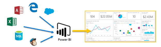
1. Visualizations
Power BI offers a variety of built-in visualizations, each suited for different types of data analysis:
- Bar and Column Charts: Useful for comparing data across categories.
- Line Charts: Ideal for showing trends over time.
- Pie and Donut Charts: Effective for displaying proportions and percentages.
- Scatter and Bubble Charts: Great for showing relationships between variables.
- Area Charts: Useful for displaying cumulative totals over time.
- Heat Maps: Highlight variations in data density.
- Tree Maps: Show hierarchical data with nested rectangles.
- Waterfall Charts: Visualize cumulative effects of sequential positive and negative values.
- Custom Visuals
In addition to built-in visuals, Power BI supports custom visuals that can be imported from the Power BI marketplace or developed using the Power BI Visuals SDK. Examples of custom visuals include:
- Gantt Charts: For project management timelines.
- KPI Indicators: Show performance against key metrics.
- Chord Diagrams: Display relationships between different categories.
- Data Connectivity and Transformation
Power BI provides robust tools for connecting and transforming data:
- Data Sources:
- On-premises databases: SQL Server, Oracle, MySQL.
- Cloud services: Azure, Google BigQuery, Amazon Redshift.
- Online services: Google Analytics, Salesforce, Facebook.
- Files: Excel, CSV, XML, JSON.
- Power Query:
- Data Import: Easily import data from various sources.
- Data Transformation: Clean and shape data using a wide range of transformation options like filtering rows, splitting columns, pivoting/unpivoting data, and more.
- Data Integration: Merge and append queries to combine data from different sources.
- Interactive Elements
Power BI emphasizes interactivity, enabling users to explore data in depth:
- Slicers: Visual filters that allow users to slice and dice data.
- Drill-through: Navigate to detailed reports from summary visuals.
- Bookmarks: Save specific views of a report for quick access.
- Tooltips: Display additional data context on hover.
- Dashboards and Reports
- Reports: Multi-page documents containing various visualizations. Users can interact with and filter these visuals.
- Dashboards: Single-page, often containing key metrics and KPIs for at-a-glance insights. Tiles in dashboards can be pinned from reports or created independently.
- Sharing and Collaboration
Power BI supports various sharing and collaboration features:
- Publishing: Publish reports to the Power BI Service (cloud-based platform).
- Sharing: Share reports and dashboards with individuals or groups within the organization.
- Workspaces: Collaborative environments where teams can work together on reports and dashboards.
- Power BI Apps: Package related reports and dashboards into an app for distribution.
- AI and Advanced Analytics
Power BI integrates AI and machine learning capabilities:
- AI Insights: Use pre-built AI models for tasks like text analytics and image recognition.
- Power BI AI Visuals: Visuals like Key Influencers and Decomposition Tree help identify key factors and breakdown data hierarchically.
- Custom AI Models: Integrate your own machine learning models from Azure Machine Learning.
- Mobile Access
Power BI offers robust mobile access:
- Power BI Mobile App: Available on iOS, Android, and Windows devices, allowing users to view and interact with dashboards and reports on the go.
- Mobile-optimized Reports: Create reports specifically optimized for mobile viewing.
- Security and Governance
Power BI ensures data security and governance through:
- Row-level Security (RLS): Define rules that restrict data access for specific users.
- Data Encryption: Encrypt data in transit and at rest.
- Compliance: Adhere to industry standards and regulations like GDPR, HIPAA, and more.
Example Workflow
- Data Import and Transformation:
- Connect to a SQL Server database containing sales data.
- Use Power Query to clean the data, removing duplicates and filtering for relevant time periods.
- Creating Visualizations:
- Create a bar chart to compare sales across different regions.
- Use a line chart to show sales trends over the past year.
- Incorporate a map visual to display sales distribution across different states.
- Building a Dashboard:
- Combine these visuals on a single dashboard.
- Add slicers to filter data by product category and sales representative.
- Interactivity:
- Enable drill-through functionality to navigate from regional sales to individual store performance.
- Use bookmarks to save and share different views of the dashboard.
- Publishing and Sharing:
- Publish the dashboard to the Power BI Service.
- Share the dashboard with the sales team, providing access via the Power BI mobile app for real-time insights.
Power BI’s comprehensive suite of tools and features enables users to transform raw data into actionable insights, making it a powerful platform for data visualization and business intelligence.
- Data Visualization Weekdays Training ( Morning, Day time & Evening)
- Duration: 40 Hrs
- Data Visualization Weekend Training (Saturday, Sunday & Holiday)
- Duration: 15 Weeks
- Data Visualization Fast Track Training
- Duration: within 20 days
Data Visualization Online Training in Tambaram
Greens Technology Tambaram providing best one-on-one Data Visualization Online training in Tambaram with Placement Assistance. Our trainers are conducting Data Visualization Training to students through TeamViewer, Skype, GoToMeeting Software. We also offering Online Data Visualization Fast Track Training with affordable course fees.
Data Visualization Corporate Training in Tambaram
In Greens Technology Tambaram, offering Data Visualization Corporate training in MNC Companies around the Chennai. We can take the Training for 15 to 20 employees in one Batch. Our corporate training based on updated Data Visualization Syllabus. Our Oracle Corporate trainers are specialized in their field and 10+ years of Experience in Oracle Platform.
Data Visualization Placement Training in Tambaram
We are offering Placement training for our students after completing the Data Analytics/BI Developer Classes. Our trainers are helps to attend the interview confidently. We are conducting resume preparation classes, Mockup Interviews, Aptitude Test.
